Text rendering
by Tomasz Stachowiak ( )
)
1. Introduction
This tutorial focuses on fairly advanced text rendering. If you'd like to add some text to your OpenGL applications, this is just the right place to be. If you're using Direct3D, PixelToaster, SDL or whatever else, don't leave too soon - the techniques presented here may as well work with other pixel plotting libraries. You only need some basic blending and texturing.
Some people might think that text rendering is trivial, but in this tutorial we're going to see that in order to support a nice set of features, such as Unicode compliance, antialiasing or kerning, we're going to need more than just a bit of coding...
This tutorial has partially been inspired by all the approaches to text rendering that I've seen on the Net...
Indirectly.
If you've been to NeHe or read some other basic tutorials, you may have left with a sour taste in your mouth. What seems to be the most common hack at text rendering is this:
- they create a texture with fonts using some free program - this will usually be a 256x256 image, containing a 16x16 matrix of font glyphs.
- they also store some additional info in a separate file - it contains the widths and heights of these glyphs
- they load the texture into OpenGL and create a set of display lists, one for drawing each glyph inside the matrix
- glCallLists then processes a string, which is treated as an array of indices into these lists
Despite being pretty fast and simple, this approach has numerous disadvantages:
- It doesn't allow kerning
- You need to have one texture per font (note that some folks try to pack multiple faces into a single texture by restricting the number of characters in each of the fonts)
- Limited to ASCII chars or possibly some single codepage like latin-1
- Requires the texture to be re-created when a different font or size thereof is needed
- A lot of space in the texture is wasted, since glyphs are packed in a uniform manner
- Due to the texture subdivision, some glyphs may be too wide or too tall to be stored in it
There's got to be a better answer to that... In fact, the method presented in this tutorial has none of the above disadvantages, as it allows:
- Proper kerning
- Tight glyph packing in textures
- Full Unicode support
- On-demand glyph rendering
2. Basics
The logical spot to begin text rendering is at individual glyphs. In case you're wondering, glyphs are the graphical symbols that represent letters, digits and special symbols (Wikipedia has a more formalized definition ). Rendering text comprises of laying out glyphs of a certain font and size onto a surface of some sort. We'd like to store them in textures, and then show to the screen through the help of OpenGL.
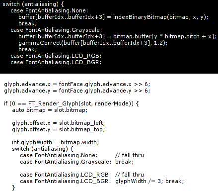
The rendering of glyphs is a very complicated process, which involves grid fitting and hinting. Most fonts are represented by splines and accompanied by special microcode, which is interpreted by a hinter. Due to the complex nature of this process, there aren't many libraries that implement proper font rendering. Luckily, there's FreeType 2. The works on it have started in 1996 and the library has constantly been improved. It's a core component of many display systems, such as X11 (through Xft).
FreeType is pretty easy to use, although the multitude of supported functions can be confusing for a first-comer. The process of glyph rendering with FreeType boils down to these basic steps:
- Initialize the FreeType library
- Load a font face
- Set the size of glyphs to be rendered
- Load a glyph
- Render the glyph
- Free the glyph
The 5th step yields a bitmap which can be directly copied into a texture. It's also pretty simple to extract additional info, such as glyph sizes, offsets or kerning.
There's one problem with font rendering though. It's covered by numerous patents, mainly by Apple. Consequentially, binary distributions often don't support many features that make the rendered glyphs really high quality. For your convenience, I've created a DLL of FreeType 2.3.4 compiled with all the sexy features. It's bundled with the demo app.
If you're compiling FreeType on your own, make sure to edit include/freetype/config/ftoption.h. TT_CONFIG_OPTION_BYTECODE_INTERPRETER and FT_CONFIG_OPTION_SUBPIXEL_RENDERING should be #define'd.
The Derelict library contains a DerelictFT package, which is a set of bindings to FreeType created by John Reimer. It allows us to dynamically load FreeType from a shared library.
Please note that we're not going to cover the exact details of dealing with FreeType here. The source code and its documentation is supposed to cover that part, but if you feel like you need more, make sure to look at:
3. The font fetish
3.1 Antialiasing
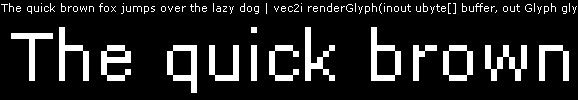
If you're into computer graphics, you probably know what antialiasing is. Let me just show two pictures then. The first one is text without antialiasing:

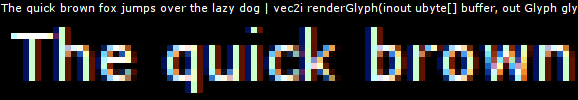
And this is the same text with antialiasing enabled:

Luckily, FreeType does the trick.
3.2 Subpixel antialiasing
If you're not interested in LCD screens, you might skip this section. But well, as LCD screens are a commodity nowadays, you'd better be interested.
Each pixel in an LCD screen is comprised of three subpixels. The subpixels are tiny stripes, each of which can be lit with a single color, but various intensities. All common LCDs have three subpixels, usually arranged vertically in the [R|G|B] order. [B|G|R] layouts are less common, and there don't seem to be many vertical ones.
Many years ago some smart folks observed that subpixels can be addressed individually. If we display a red color, only one subpixel in each lit pixel will be on. This gives us three times the (horizontal, in our case) resolution.
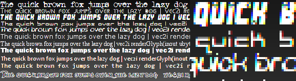
Here's where subpixel antialiasing steps into play. Standard (grayscale) antialiasing already improves visual quality most of the time, but it doesn't help a lot at tiny glyph sizes. By exploiting subpixel rendering, we can draw crisp text even at the smallest heights possible. Consider the following picture
So how difficult is it to support subpixel antialiasing? Not hard at all! FreeType can be compiled with it. We can then tell it to render glyphs in the 'LCD' mode and it will give us three times wider bitmaps. Note that we only care about horizontal subpixel layouts in this tutorial, as these seem to be the most common. If your users own LCD screens with vertical layouts, it shouldn't be a problem to modify the code.
3.3 Patented hinting
As I mentioned before, FreeType disables the patented features by default. It's very important that you enable them if you compile the library on your own. In order to motivate you, I've prepared the following comparison image:
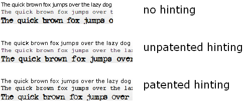
You can read more about the patenting issues on this page.
3.4 Special LCD filtering
Some fonts come with excellent hinting data, which makes them look extremely crisp at small sizes. Also, when antialiasing is applied to tiny glyphs, it often reduces their readability. A prime example is Verdana. The readability of this font without antialiasing has motivated me to create my own subpixel filter. To illustrate the problem, look at the following pictures (white on black makes the problem more apparent):
The smoothed version might seem better at first, but eyes get tired of looking at their smooth shapes, unable to catch correct focus. Glyphs tend to blur and mend with one another, which is usually undesirable.
What is LCD/subpixel filtering then? When FreeType renders glyphs with subpixel precision, the result looks more or less like this:
The fact that some lines are thinner than one pixel makes them only span parts of pixels, so they cannot be white as expected. The color fringes are unacceptable, but they can be almost completely removed by using a subpixel filter.
A subpixel filter is like a grayscale horizontal blur filter, but it operates on subpixel intensity values. Unfortunately, I've found that FreeType's default subpixel filter makes the result too blurry, as well as giving a greenish halo when text is rendered black-on-white.
The gamma of the above image has been increased to make the problem more apparent, but it's also visible without gamma tweaks. If you zoom into the picture, there's actually no green color around the text, but blue and yellow colors resulting from subpixel rendering mix into green when viewed from a certain distance.
So there we have three rendering modes:
- No antialiasing - very readable with excellent fonts, but a bit too aliased. Ugly with other fonts.
- Filtered LCD rendering - blurry, halos, but great with big fonts
- Subpixel rendering without filtering - massive color fringes, but awesome glyph shapes
My approach was to combine these. After a bit of tweaking with the weights, I came up with this:
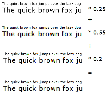
So the plan is as follows:
- We ask FreeType for the unfiltered subpixel rendered glyph
- We filter the glyph, and add the unfiltered component
- We ask FreeType for the aliased glyph
- We add the black & white bitmap to our filtered + unfiltered LCD
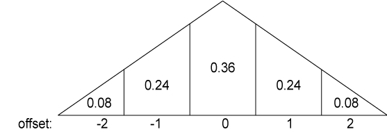
We can use a triangular kernel to filter the subpixel-precise glyph, as in the following picture:
When I implemented it and compared to FreeType's DEFAULT filter, it turned out that our results where the same. So it's like we asked FreeType to render the glyph three times (one more for the filtered LCD version) and summed the weighted results. But by doing the filtering on our own, we can spare a few cycles, as well as have finer control over the process. We might e.g. use a Gaussian filter instead of the triangular one.
In the end, we add the unfiltered color:
float total = 0.f;
total += data[0] * 0.08f;
total += data[4] * 0.08f;
total += data[1] * 0.24f;
total += data[3] * 0.24f;
total += data[2] * 0.36f;
total *= 0.55f;
total += data[2] * 0.2f;
if (total <= 0.f) return 0;
if (total >= 255.f) return 255;
return rndtol(total);
}
The result is pretty plausible:
4. Packing the glyphs into a texture
I've been cheating so far, showing off with rendered text, while we only know how to render individual glyphs. We need to stuff many of these into a texture. If you wanted to use one texture per one glyph, please slap yourself with a melted donkey now.
So, how do we pack glyphs into textures? The most obvious answer would probably be a matrix. But then it would be pretty hard not to waste space if we had various glyphs sizes.
Instead, we can arrange the texture space in horizontal lines of variable height. It might have 8 pixel high lines for some glyphs, 24 pixel high for others. This should minimize the texture space waste.
So let's now assume that we have some auxiliary data structure, which organizes our texture space. When faced with the task of inserting a new glyph into it, how do we pick the best line? No, it should not be 'any line which can fit that glyph'. In order to minimize space waste, we'd like to pick the line with minimal height, which can still contain our glyph. Additionally, if the line is taller than the glyph by some ratio, we'd like to create a new line, instead of wasting space. On a last thought, it might be good to always create lines a bit taller than the glyph at hand requires, so more glyphs will match its size. Obviously, when we're out of lines, we should create a new texture.
Naturally, the 'new line vs best line' and 'extra height for a new line' thresholds should not be arbitrary. I've experimented a bit and came up with the following rules:
- If the glyph's height is 0.7 of the best line's height, it should trigger new line creation
- New lines should be 10% taller than the glyph's height.
Here's the concept in code:
Block* res;
float bestRatio = 0.f;
PackerLine* bestLine = null;
// find the 'best' line
foreach (inout page; pages) {
foreach (inout line; page.lines) {
if (line.size.y < size.y) continue; // won't fit our request vertically ...
if (line.size.x - line.xoffset < size.x) continue; // ... horizontally
float ratio = cast(float)size.y / line.size.y;
if (ratio > bestRatio) {
// ok, this is better than our current 'best'.
bestRatio = ratio;
bestLine = &line;
}
}
}
if (bestLine !is null && bestRatio >= acceptableHeightRatio) {
return bestLine.getBlock(size);
} else {
// we haven't found any line that would suit our needs, try to create a new one
foreach (inout page; pages) {
auto line = page.extendCache(vec2i(size.x, extendedHeight(size.y)));
if (line) return line.getBlock(size);
}
// there was not enough space in any page. we need a new cache.
return extendCache(vec2i(size.x, extendedHeight(size.y))).getBlock(size);
}
}
How well does that system work? Here's a picture of some packed glyphs:
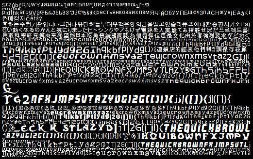
The 512x512 texture above (I stripped out the empty part, there's a tiny black border for presentation purposes) contains all glyphs that are required to draw the following screen:

As you can see, texture space waste is minimal. It's far better than any matrix approach would do.
5. Laying out the glyphs
Once we have all required glyphs in a texture, we can finally go around to laying them out, so they can be rendered as actual text. It's not very hard to do simple layout, but there's one detail I haven't mentioned yet. Glyphs don't necessarily need to have integral dimensions. FreeType uses units which are 64 times smaller than a pixel. Why would anyone do something as crazy? Usually, to do WYSIWYG text rendering. If one tells FreeType to render a glyph at a fractional position, it will look differently than if we used an integral offset ( or no offset, in our case ). This yields font rendering which looks very smooth, as if the text was printed to paper ( you know, that oldskool wood's derivative ... ). There are two problems with it though:
- We couldn't store glyph images separately, but would have to render entire strings and store these in textures.
- The text might look smoother, but in fact is less readable
Thus we'll restrict the layout to integral positions.
In this case, layout is just about positioning glyphs using the offsets and sizes FreeType gives us:
- render a glyph at the pen position, translated by its internal offset
- move the pen by the glyph's advance value
- goto 1
This method yields the following result:

It's pretty obvious that there's something strange with the placement of 'A' and 'V' letters in the picture above. There's nothing wrong with our algorithm, but we haven't accounted for the fact that some glyphs may be packed tightly, while others must be far apart. For instance, 'A' and 'V' may be placed next to each other, just like 'r' and ','. But then, 'A' and 'A' must be far apart. That spacing is font, size and glyph-pair dependent.
Madness? This ... is ... KERNING!
Luckily for us, good fonts contain kerning info. It is basically what we noticed earlier - a special offset between specific glyph pairs. And again, FreeType has a useful function, which extracts this data: FT_Get_Kerning. It is usually a negative value, which should be added to the standard offset between glyphs. Pretty simple in reality:
FT_Vector delta;
FT_Get_Kerning(fontFace, previous, glyphIndex, FT_Kerning_Mode.FT_KERNING_DEFAULT, &delta);
penX += delta.x >> 6;
}
But it seems to work:

6. Rendering
We'd like to draw text of any color, on any background, without knowing the background's color or texture. The text to be rendered may be semi-transparent. Of course we'll be using alpha blending. The only trouble lies in determining the parameters.
In order to derive the blending mode, we have to realize one trivial, but maybe not immediately obvious fact: We have three alpha channels in the glyph texture. Each subpixel has its own alpha, and each pixel has just one texel of alpha. Thus, opacity values are stored in an RGB texture. Note that although the texture stores values from the [0; 255] scale, we're going to use the more intuitive [0; 1] range in our reasoning.
What's the blending operation we'd like to perform? Let's forget about colors for a while and only think in single-channel alpha blending. If our font texture has an alpha value a at some spot, the text will be visible with a intensity, and the background will be seen through it with the intensity of 1-a. We actually have two alphas here: The alpha value encoded in our texture, a, but also the value we pass to our text rendering function, to make it translucent. Let's call the second alpha, A. So finally, the text will be of a*A intensity, and the background 1-a*A.
Ok, now recall the multiple alpha intensities per pixel that we have. It turns out that our a is actually three values. No problem, OpenGL can cope with that. As well as multiple alphas, we have the color at which the font should be rendered. We'd like to only multiply the text color by it. It doesn't affect the background at all. Let's refer to the color as C. Our equation becomes:
a*A*C + (1 - a*A) * background
Wait wait wait, why is it not a*A*C + (1 - a*A*C) * background? Let's assume that we're drawing black text over a white background. Thus, C = (0 0 0), A = 1. Let's try the first equation:
a*A*C + (1 - a*A) * background =>
a*1*(0 0 0) + (1 - a*1) * background =>
(1 - a) * background
This looks pretty sane. Opaque glyph elements (a > 0) will mask out the white background, making the text black indeed.
Now let's try the second (wrong) equation:
a*A*C + (1 - a*A*C) * background =>
a*1*(0 0 0) + (1 - a*1*(0 0 0)) * background =>
1 * background
This is not ok, as it will always yield a white color, thus our text won't be visible.
So finally, our blending equation has the following properties:
- RGB subpixel alpha values dictate transparency
- Overall alpha can be controlled by another value, A
- Font color doesn't affect the background in any way
Remember the standard OpenGL blending equation?
src_color * src_factor + dst_color * dst_factor
If we enable GL_COLOR_MATERIAL and use texturing, src_color will be computed as the texture sample times the current vertex color. The dst_color component is the current background color. Let's first try to substitute the second part of the equation:
(1 - a*A) * background =>
(1 - a*A) * dst_color =>
dst_factor == (1 - a*A).
Note that a comes from the font texture, so we have to use SRC_COLOR for it. And since it has to be multiplied by A, we should use glColor3f(a, a, a). But what can we do with the first part of the equation? Ideally, it should be SRC_COLOR * C, but we cannot do that, as we already set the color to (a a a)... We have two options here:
6.1 Using gl_ext_blend_color
This OpenGL extension lets us use an additional constant color for the blending operation. It's denoted as GL_CONSTANT_COLOR_EXT and specified by calling glBlendColorEXT. We can put A*C into the constant color and our blending equation is complete:
glBlendFunc(GL_CONSTANT_COLOR_EXT, GL_ONE_MINUS_SRC_COLOR);
glBlendColorEXT(C.r * a, C.g * a, C.b * a, 1);
glColor3f(a, a, a)
There are two caveats here though:
- The color is constant, thus uniform for all vertices within a single glBegin .. glEnd pair
- Not all GPUs support the gl_ext_blend_color extension (my Mobility Radeon 7500 doesn't)
The 1. is not that bad. It requires a separate pair of glBegin .. glEnd calls for each font color or alpha value, but it doesn't seem to impact performance very badly.
Number 2. brings us to the next section:
6.2 Without gl_ext_blend_color
The only thing we can do without the helpful extension is splitting the blending operation in two passes:
- glBlendFunc(GL_ZERO, GL_ONE_MINUS_SRC_COLOR) and glColor3f(a, a, a)
- glBlendFunc(GL_SRC_ALPHA, GL_ONE) and glColor4f(C.r, C.g, C.b, a)
This approach has two flaws as well:
- It introduces 100% overdraw for text, thus reducing performance
- Things get bad when we draw glyphs that lay over each other
And again, 1. is not very bad. The rendering is still very fast. 2. is trickier though. When glyphs from the same rendering step overlay, the second pass will cause additive blending on these parts, thus the intensity will be higher than desired. We can help it by drawing overlaying glyphs in separate steps. If we do the two passes for one of the overlaying glyphs, and then the two passes for the other, everything is fine. We also have two scenarios here:
- Some fonts have glyphs with fancy shapes that can span even three 'normal-width' glyphs, thus overlapping within the same line of text
- We'd sometimes like to draw semi-transparent lines of text on one another
Fortunately, 1. can be detected automatically by a simple trick in the renderer. When we're drawing text, we can store the bounds of the previous glyphs as a rectangle. When we detect that a glyph to be drawn would intersect that rectangle, we add it to a list instead of drawing immediately. We finish the second pass, then return to that list and recurse the process until the list is empty.
The 2.s used to be trickier, but this one is simple. We might also auto-detect that case, but it tends to yield too many false positives, and the added computational complexity is not always worth it. So we can add a flush() function to our Font class, so it will do the second pass for all queued glyphs.
7. The sample app
A tutorial is not complete without a sample application, so here's how mine looks like:

The text in the middle is semi-transparent and scrolls from right to left. In the background, there's a conceptual beam that sweeps text from a file and updates it on the screen. The text slowly fades out through green to black. There's also a red caption in the corner. The shadow is emulated by first rendering the same text with a darker color.
The demo app can load any UTF-8 text file and display it like that with a specified font. It also supports a few options, which control how the text is rendered: it can be drawn without antialiasing, with grayscale antialiasing, RGB or BGR subpixel rendering. You can also switch between the standard LCD filtering or my fancy Crisp filter.
8. Extensions
This text rendering system is of course far from perfect. Some more advanced uses will require text scaling, rotations, skewing or freeform transformations. When rendering glyphs with FreeType, we can tell it to use a 2x2 matrix, so rotation and scaling operations can be done with great precision.
We could also like to have text with effects, such as glows or shadows. To some extent, these can be emulated by re-drawing the text multiple times, but more sophisticated effects require different techniques.
Textured glyphs should be pretty easy to do. Simple multitexturing on a Riva TNT - class hardware will be enough.
There's one more technicality which was omitted by this tutorial. We cache the glyphs, but we never free them. A simple mark & sweep garbage collection scheme might be implemented to deal with that.
9. The source code
... comes with the sample app.
The source code provided with this tutorial is by no means minimal. It's a part of a GUI toolkit I'm currently working on - Hybrid. I hope the additional structure won't make the code any less readable.
Probably the only difference between the approach discussed in this tutorial and the code is that the demo uses RGBA textures for the glyph caches. That's because the cache is used for more than just fonts in Hybrid. It can store RGBA icons, cursors or whatever else needs to be packed into larger textures for performance and memory-saving reasons.
The code is best viewed with DCode or Entice, using 8pt verdana and 4-space tabs.
hybrid/test8.d
The demo app, test #8 of Hybrid.
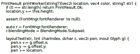
hybrid/Font.d
Interfaces with FreeType to render glyphs, with the BoxPacker to pack them in textures provided by the IconCache. It does text rendering through a FontRenderer.
FontMngr - a wrapper over FreeType
Font - what we use to render and layout text.
hybrid/FontRenderer.d
An interface that Font classes need to render themselves.
hybrid/GuiRenderer.d
Provides some basic facilities of a quad-based GUI renderer, but needs a concrete implementation, such as...
hybrid/GlGuiRenderer.d
Sample renderer that uses the OpenGL API and the blending techniques described in this tutorial.
hybrid/IconCache.d
Provides an interface through which one may acquire rectangular texture areas of specified size and update them.
hybrid/BoxPacker.d
A general-purpose 2D box packer, which uses the line-based strategy discussed in this tutorial
hybrid/Utils.d
Some simple utilities, such as a Rect[angle] struct
hybrid/Texture.d
Simple abstraction of a texture and a texture manager
maths/Vec.d
2D, 3D and 4D vector structures, useful for all sorts of computations
maths/Fixed.d
Fixed point maths struct used in the Vec module
utils/Memory.d
Helper functions for simple GC-less, malloc-based memory management
utils/Singleton.d
Some very simple singleton utils, used in the IconCache
utils/StructClass.d
Templates that make life with structs and classes easier
10. Going further
A long time after writing this article I've stumbled upon what I think might be the best font rendering resource on the net: http://www.antigrain.com/research/font_rasterization/index.html. Maxim Shemanarev has covered the topic with great detail and insight not found in other places, eventually coming up with a text rendering algorithm that gives better results than this article or whatever Windows or Linux can produce. Still, the 'crisp' filter I'd presented could be better for some purposes, as many people don't like their text being too blurry. Additionally, my tutorial presents text rendering in the context of OpenGL, along with an efficient way to render it. All considered, I strongly recommend reading Maxim's article, yet I still think my tutorial could be a valuable piece of information.
this tutorial is licensed under the Creative Commons license